Volare
Volare solves the problem of global food production waste by recycling and processing side streams into new, natural proteins, oils, and fertilizers. Volare's scalable upcycling solution based on black soldier flies is a global-level solution to the problems of food production that may even solve the future of human nutrition.
20/20 Helsinki joined forces with Volare to renew their brand concept, visual identity and website. The imagery was created from raw materials, food production waste and the final products, and together with the landscape images they form a beautiful whole, where waste is not waste, but a valuable raw material that can be used to change the world.

Background
Volare’s aim is nothing less than to solve the global food system – to stop waste, and to help realize true circularity. Volare is designed from the get-go to be scalable. Both in plant size and facility count.
Our task was to renew Volare's visual language and make Volare even more interesting for potential and current customers, as well as for investors and the media of the next funding round.
We wanted to highlight Volare as an enabler of a more sustainable future on a large scale in a modern way. Our approach for the brand concept was to shift the focus from side streams, insects, and waste to the future and the ability to envision the bigger picture of the future of food.
Visual identity
We emphasized the core message with contemporary simplicity – making the brand professional, sleek and high-quality.
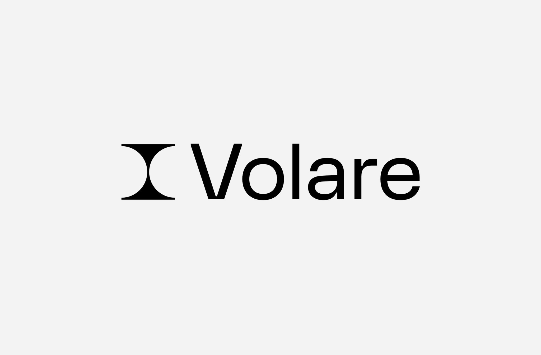
Volare’s renewed logo is inspired by their innovative process, that is a combination of proprietary knowledge and unique technology, enabled by world’s most efficient bioreactors, black soldier flies. The logo showcases the circulation of matter – how food industry side streams are collected for production and processed back into new, usable products.
Volare's visual identity relies heavily on the black and white expression, that is supported by one primary color, dark green, as well as a wide palette of secondary colors.
The main focus on the visual identity is centered on vivid imagery, where Volare acts as an abstract lens shaping how side streams will be seen and understood in the future. The waste is presented with a utopian tone of voice, aiming to dissolve from negative associations related to the side stream industry.


Imagery
Super-close-up, aesthetically stylized, and abstracted images were created from raw materials, food production waste, and finished products. Paired with landscape images, they form a beautiful composition where waste can be seen as valuable raw material transforming the world.
Distortions created by the camera lens, carefully selected colors, and thoughtful composition contribute to a positive utopian feeling and a dreamlike atmosphere of a more sustainable future.
All production elements are presented in a beautiful and creative manner, fading away negative perceptions related to side stream industries and creating an anticipatory and hopeful perception of change.
The overall presentation is positive and dreamily atmospheric.


Production
Client
Volare
Chief Operating Officer: Jarna Hyvönen
20/20
Client Director: Mia Oksala
Art Director: Tino Nyman
Copywriter: Rasmus Stoltzenberg
Producer: Veera Moilanen
Photography
Photographer: Anton Sucksdorff
Assistant: Jari Hämäläinen
Retouch: Patricia Karlsson
Set Design: Piia Honkanen
Website coding
Bou