Koherent
Meet Koherent – the driving force behind the future of smart societies.
Koherent is enabling a world, where building automation, autonomous factories and all self-driving, self-parking, self-flying cars, drones and delivery vans are possible, not just an expensive dream. This is done by building the world’s most accurate positioning grid. Koherent is miniaturizing location-finding to fuel the automated societies of tomorrow, today.
We teamed up with Koherent to bring their cutting-edge vision to life by building a brand concept and creating their visual identity and website.
Background
What happened to the promise of smart cities and building automation? All the self-driving, self-parking cars and taxis? Trucks and loaders that would operate without human supervision?
The promise was never delivered on. Super-accurate positioning data just wasn’t available. The technology just couldn’t deliver. You couldn’t rely on satellite positioning to work indoors, or amid highrises. It wasn’t accurate enough to trust not getting run over at the next street crossing or even to park your car.
Koherent was born to take positioning accuracy to next levels. To bring true location focus and depixelate the real world. Where others see a blur, they see location on sub-millimeter-scale. This is done by building the World’s most accurate positioning Grid.
As our profession lies in turning new innovations into stories people understand and want to act on, Koherent reached out to us to help them to create a brand concept that is outstanding and reachable for wider audiences.
We created a contemporary visual story with a strong message of their innovation that delivers accurate, precise and reliable data – in real time and in new levels.
Contemporary eye for the detail
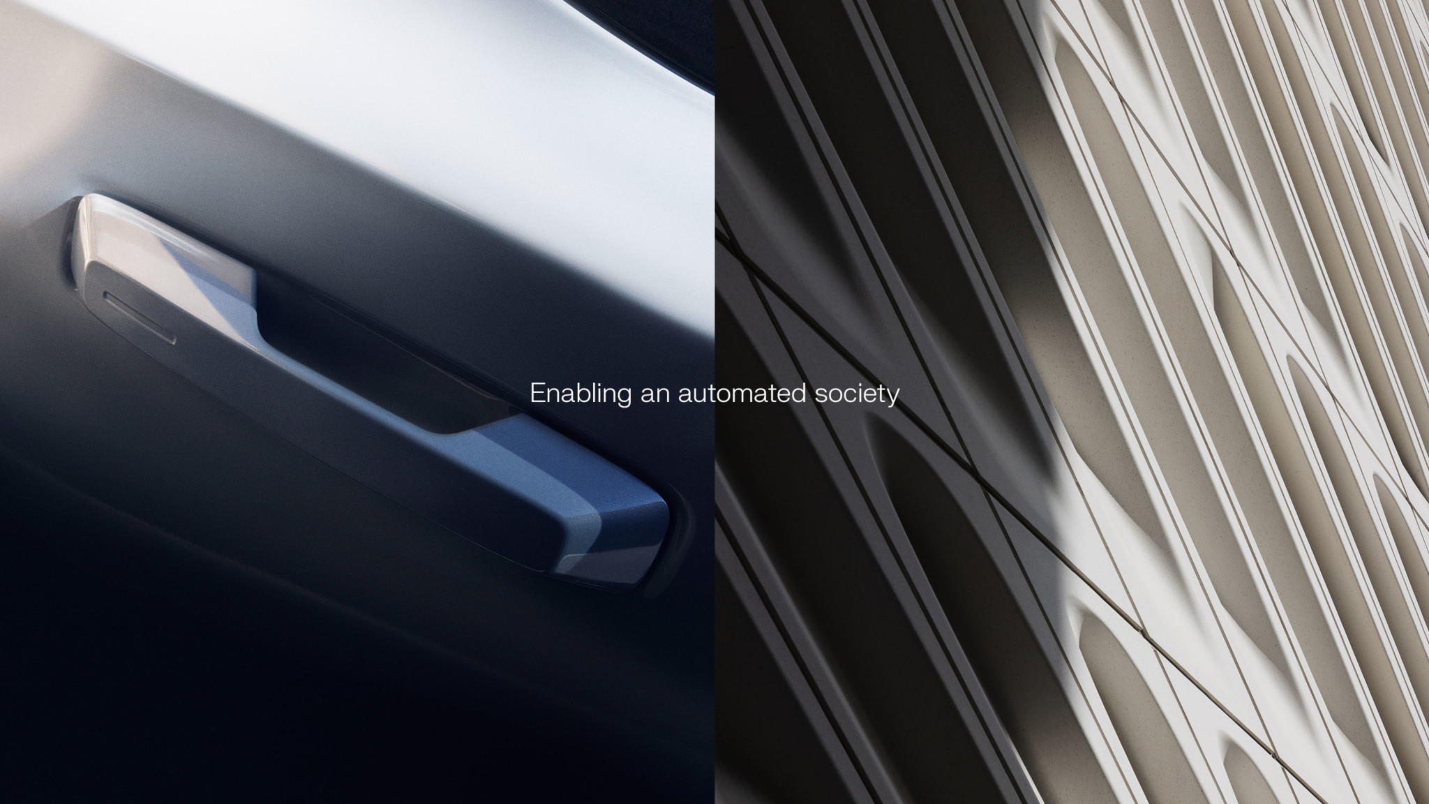
Koherent’s imagery is analogous to what they do.
In esthetically pleasing, technically high-quality images, we show how their technology’s level of accuracy compares to the blurry, pixelated world of other technologies. Instead of a single off-focus pixel throwing the whole world out of focus, Koherent offers a laser-focused image. This is highlighted with depixelation that is used as a visual effect as a part of Koherent's overall brand.
The central theme is showing the effect of extreme accuracy. Putting everything in their place.
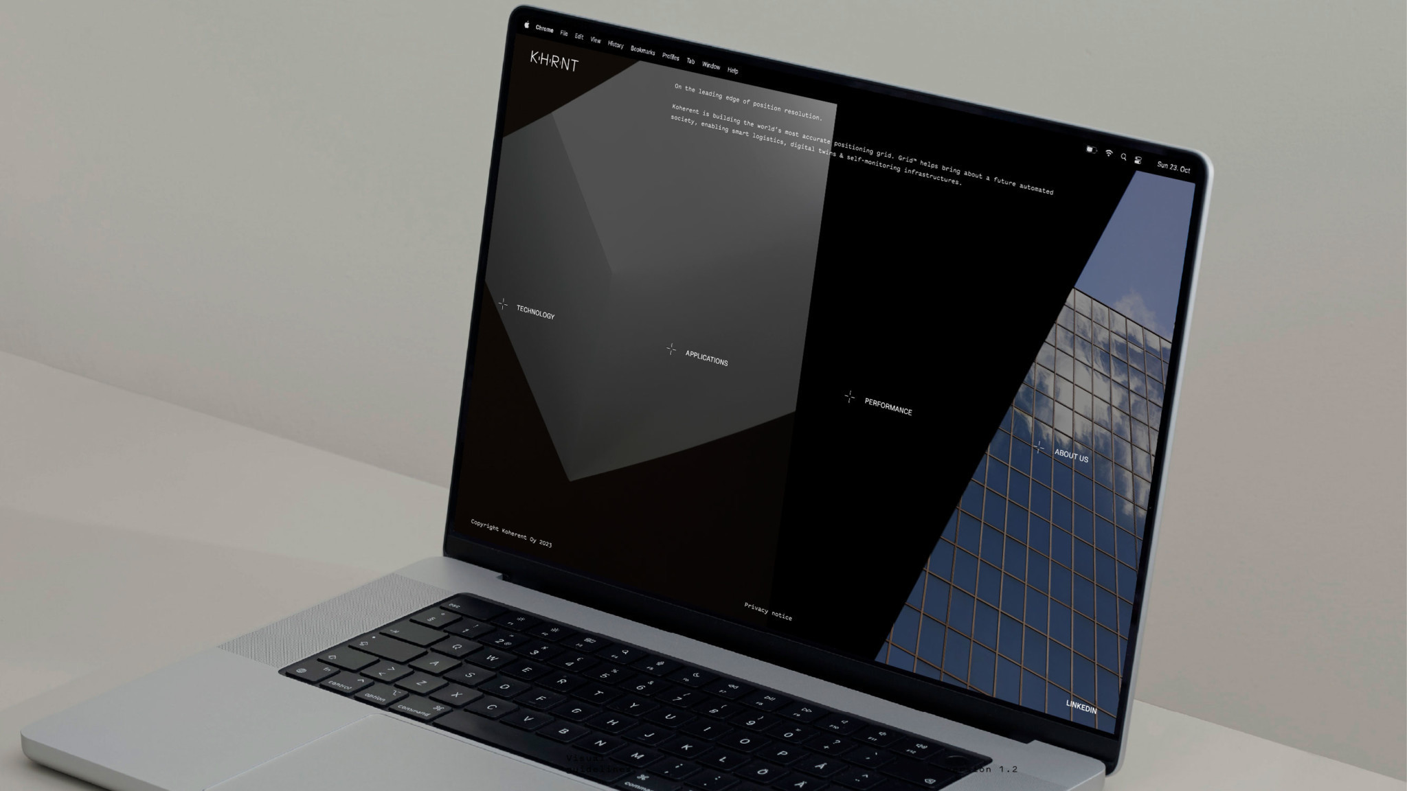
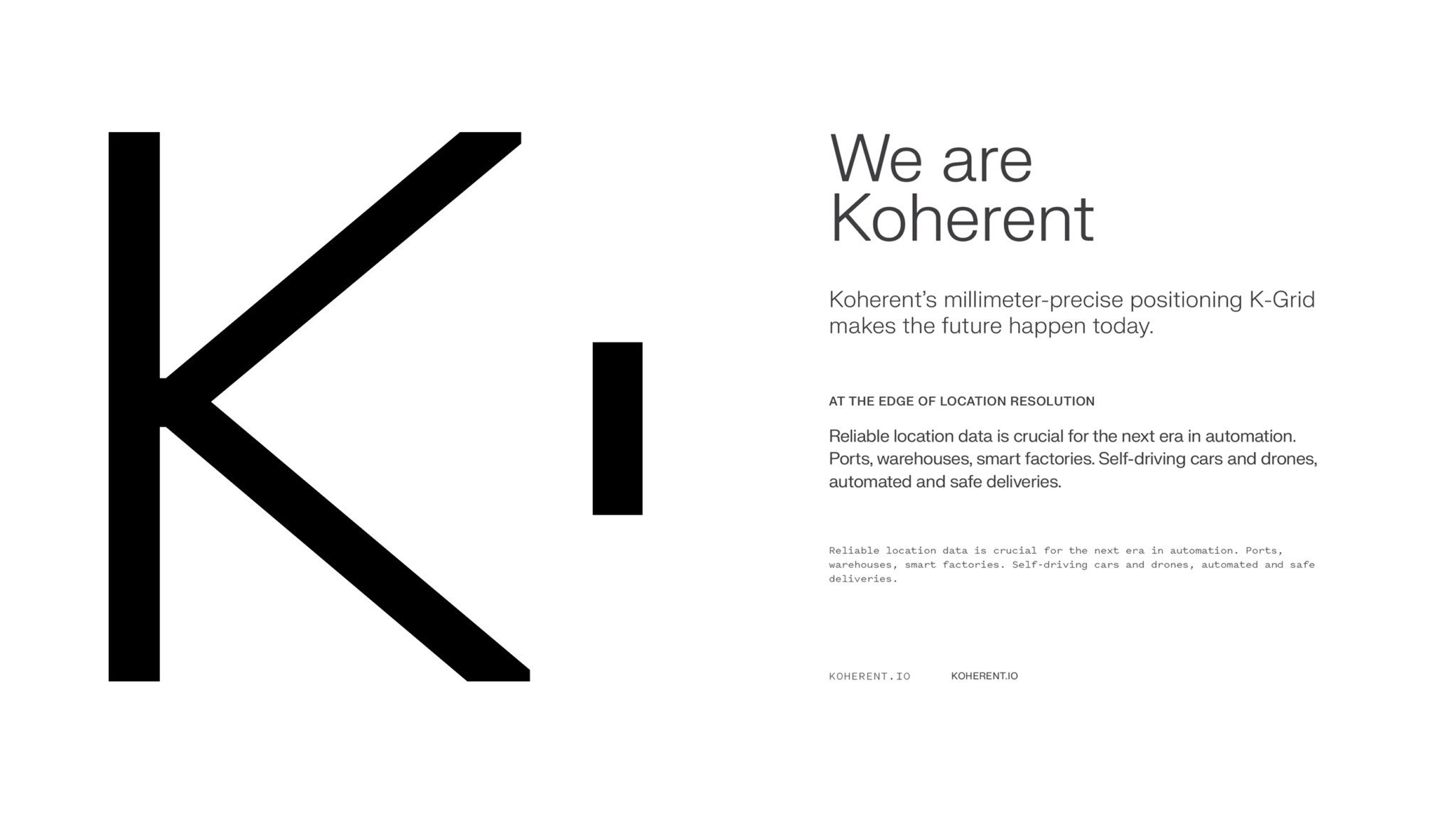
Koherent’s visual identity is built around a graphical black and white expression. Its clarity underlines the brand’s contemporary approach to the world. The graphic look is further enhanced through strong imagery.
Imagery
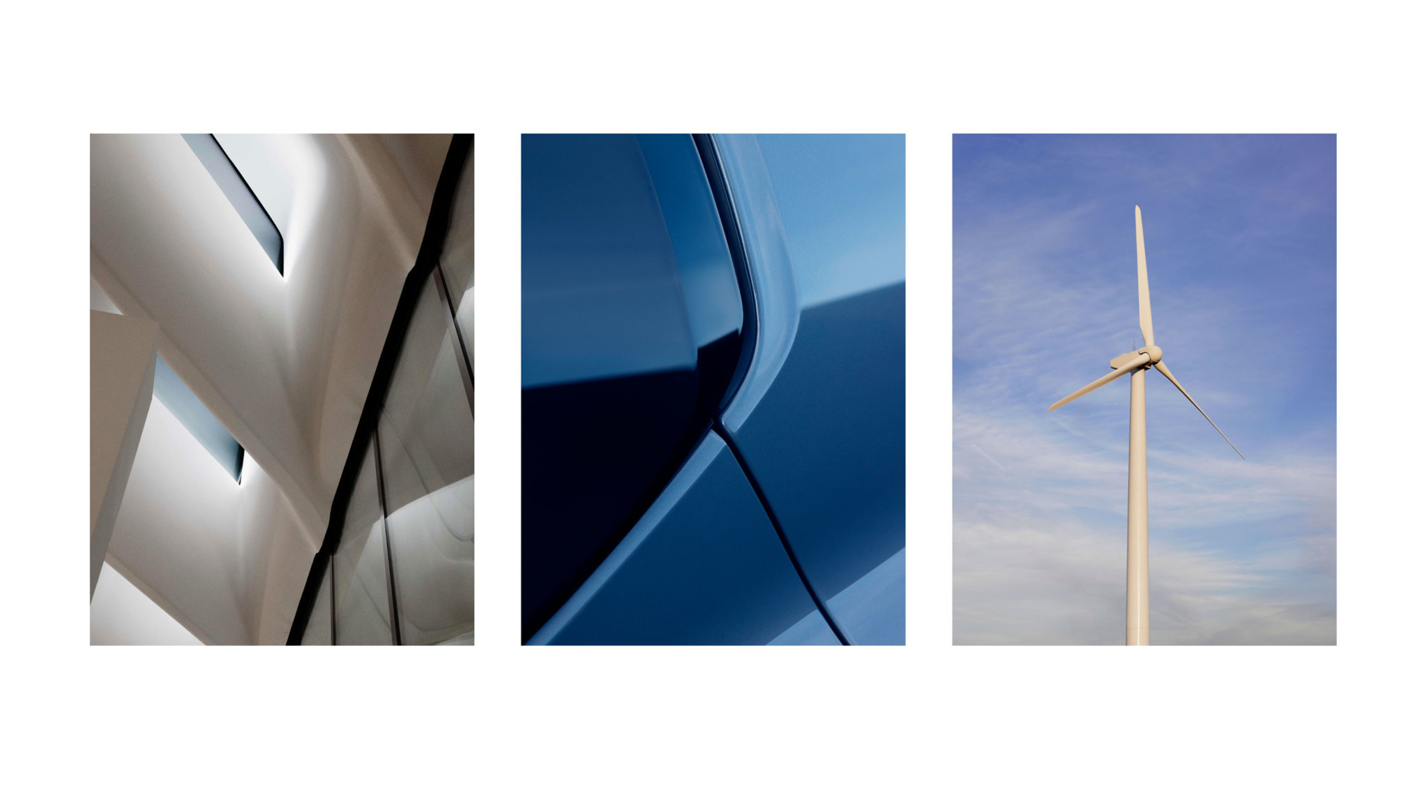
Eye for detail
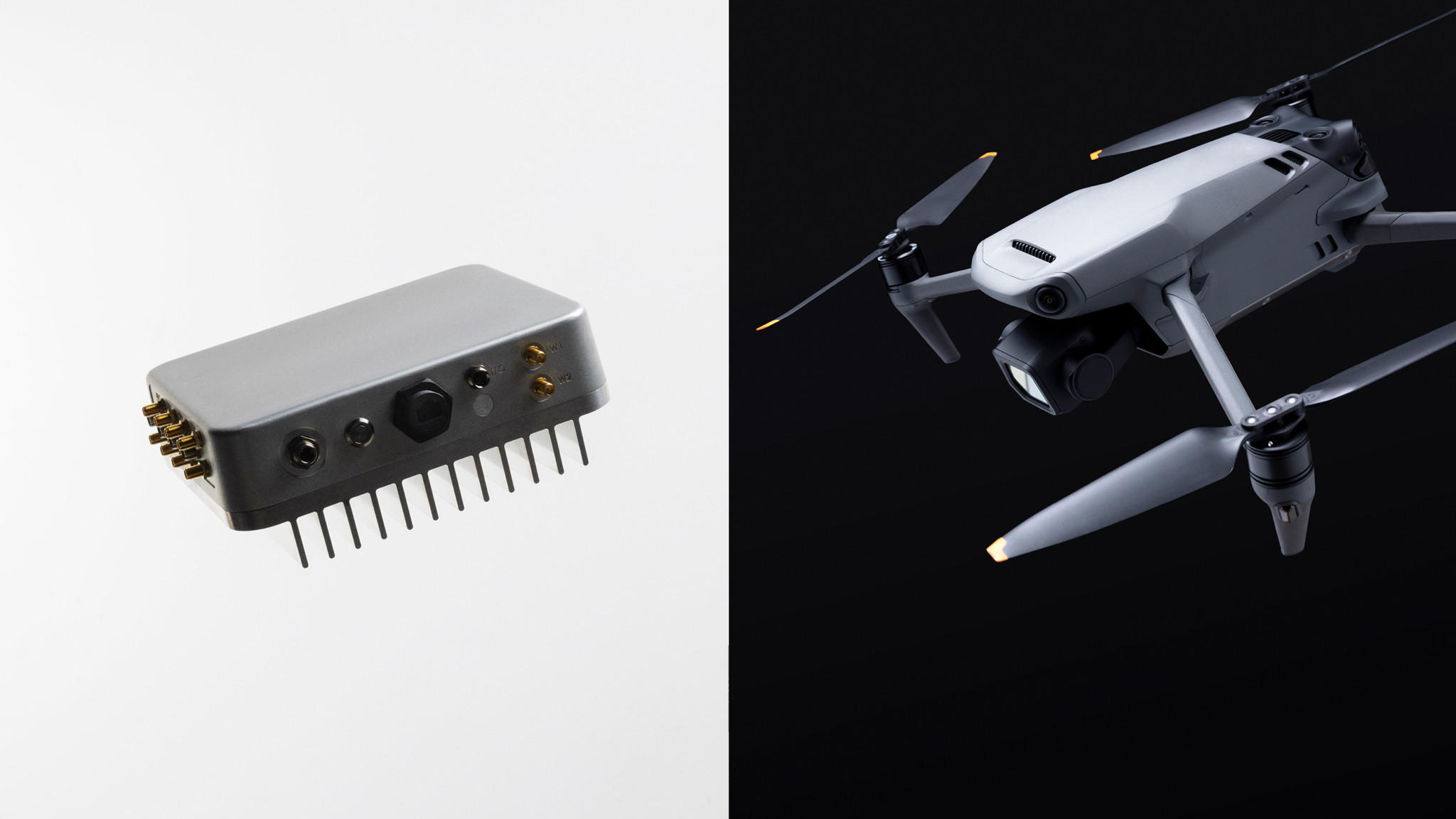
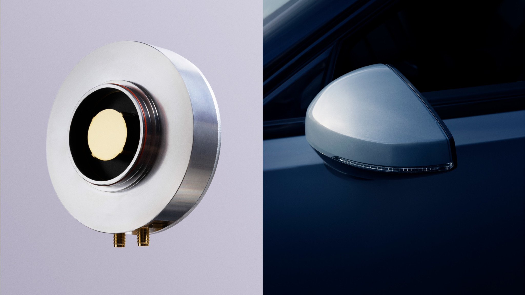
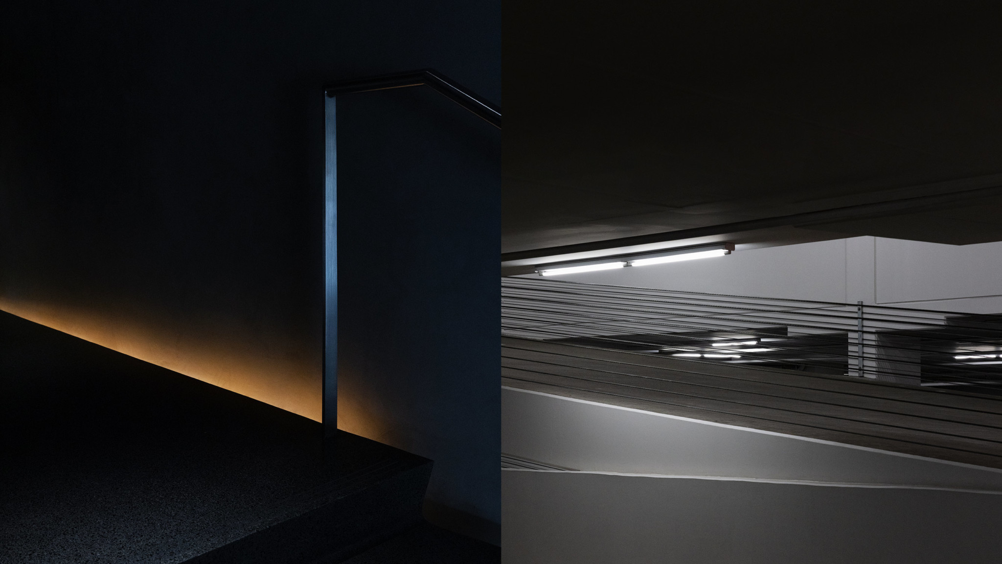
Extreme closeups highlight the robustly accurate nature of the technology. The imagery has a strong feel of the material and physical.
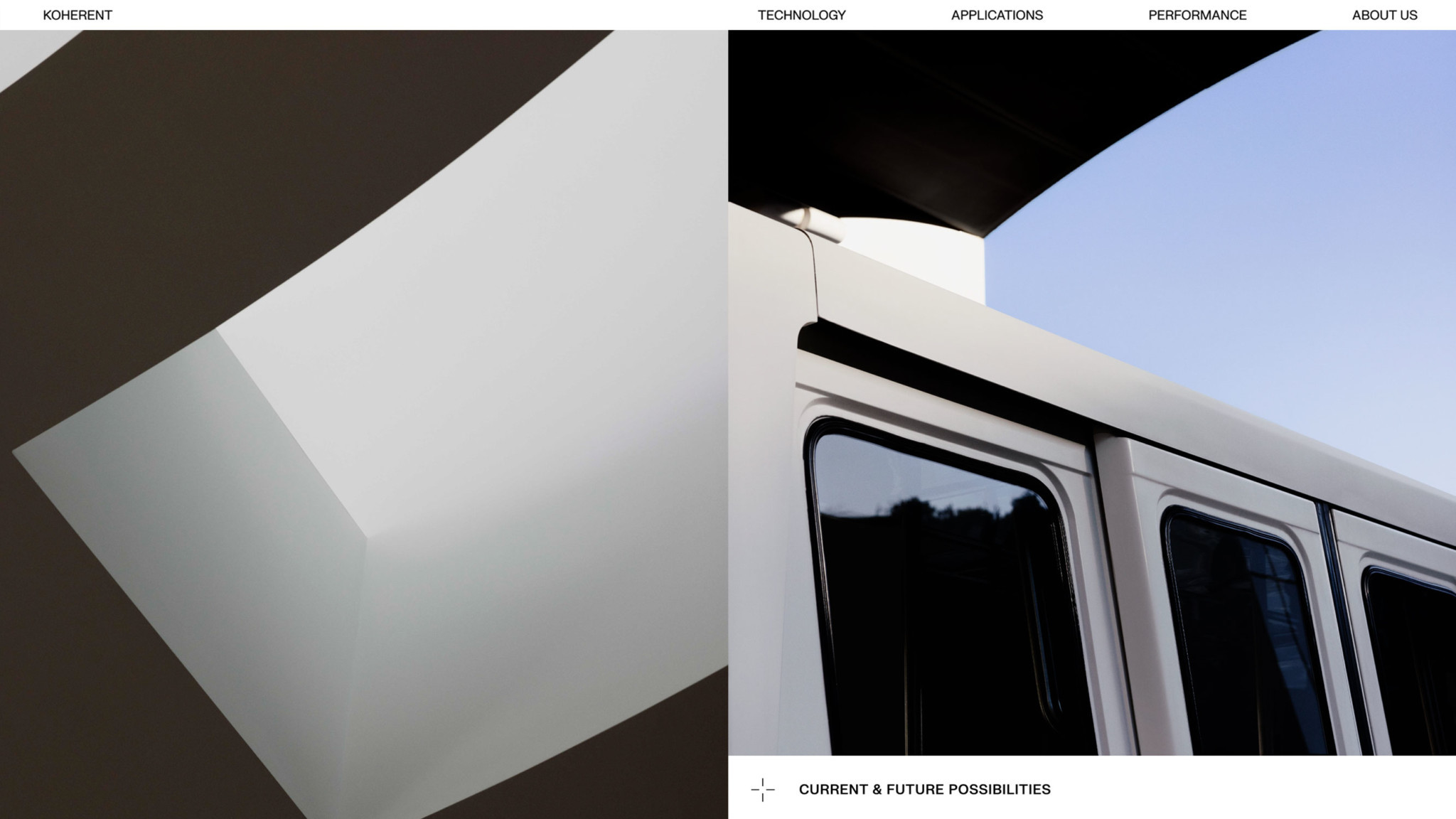
Eye for our surroundings
The details of buildings and our surroundings is picked up in the images in tandem with the landscape shots.
Eye for the big picture
We reveal our eye for the big picture, and the future, in these poetic shots of landscapes and scenery.
On the leading edge of position resolution
We brought Koherent’s cutting-edge innovation to life with graphic elements that visualizes the increasingly accurate measurement data.
Visuals of the ruler and tracking point, that is inspired by real life visual tracking UI’s, creates interesting details and executions in illustrations and helps to highlight crucial information in textual and visual content.
Production
Client
Koherent
20/20
Client Director: Mia Oksala
Producer: Veera Moilanen
Art Director: Tino Nyman
Copywriter: Rasmus Stoltzenberg
Photography
Photographer: Anton Sucksdorff
Retouch: Patricia Karlsson
Set Design: Piia Honkanen
Film
Production: 20/20 Helsinki
Director: Jenny Stringer
DOP: Anton Tevajärvi
Producer: Mia Oksala
Website coding:
Otto Lindblom

