Hatch: Brand refresh.
Hatch is the game-streaming service that wants to do for games what Netflix has done for shows and movies.
When it was time to come out of beta and put the brand out there for the world to see, Hatch turned to 20/20 Helsinki to create a new tagline, visual identity and brand / product film.
The result is a set of assets that express the inclusive, approachable and – above all – playful nature of the brand and the service, with games and player at the center of everything.
Starting point.
In 2017 there were 2.8 billion mobile gamers who were actively using games on their mobile devices every month. The amazing growth of mobile games across the world means more and more people engage with gaming experiences previously limited to users of other platforms such as PCs and consoles. This expansion means the characteristics, needs, and motivations of those playing games are more diverse.
The brief was to come up with a tagline and visual concept that speaks to a very broad audience when necessary, but it’s also completely scalable to different target groups and content, new series launches, events and more.
Concept.
20/20 created a conceptual umbrella that leads our initiative to create a simple and consistent common thread throughout all brand comms and content.
It´s scalable and lives on well after launch. It has a strong call to action that can be creatively and strategically expanded from emotional to tactical. It can be used to speak to a range of target groups in both current and future markets. Strategically and creatively, it´s an extension of what and why we are as a brand.
Execution.
Tagline.
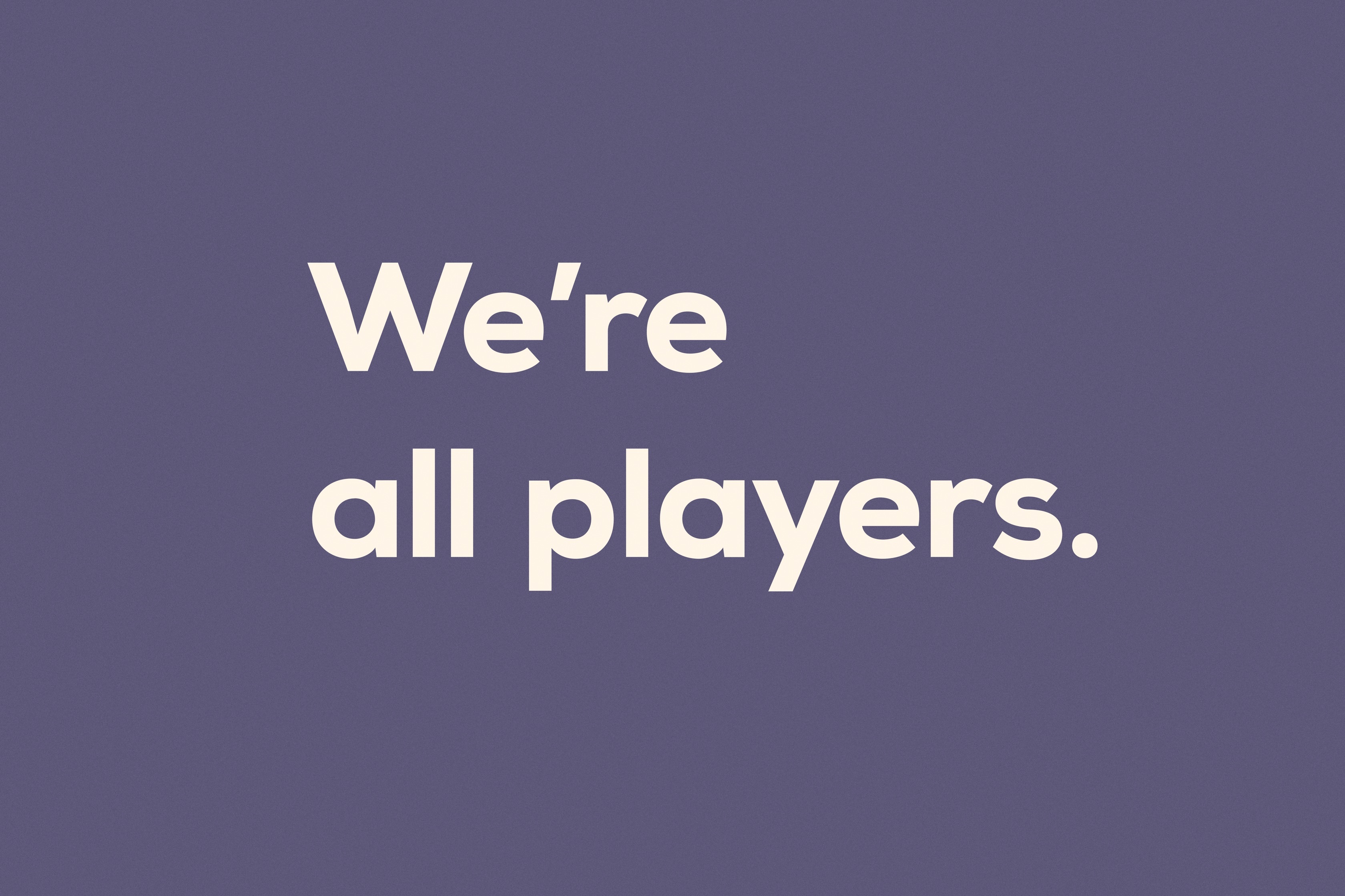
The We’re all players tagline can be scaled to speak to different target groups and to communicate our core message(s) in all kinds of concepts – from emotional and inspirational/aspirational to super tactical.
Brand / Product Film.
The goal of the film is simple: to clearly communicate what Hatch actually is and what it enables. First, we want people to get that Hatch is an awesome new app that’s going to let them stream games just like they already stream music, movies and shows. That means that when you play on Hatch, games are a tap away instead of a whole download-process away. Hatch lets you play whenever the urge strikes. And it lets you play with and against friends and other players.
Visual language.
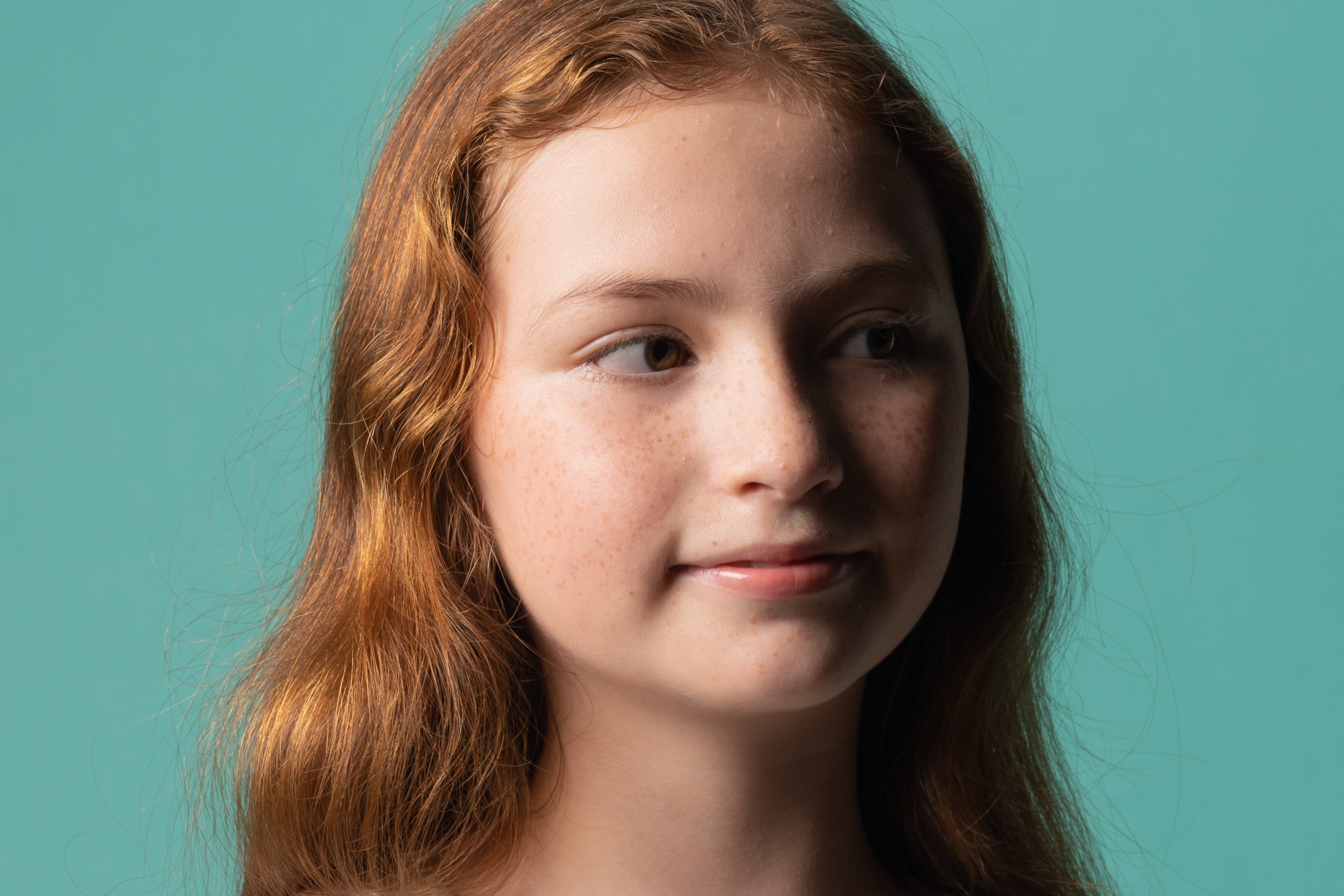
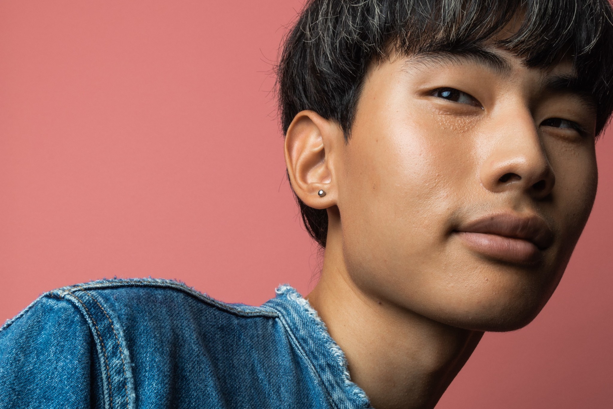
Colorful / Playful / Graphic. The playfulness and fun comes from the colors and tone of voice. The core of the brand is built on joy of gaming and the app itself to the wide range of games. Wide range of playful colors and large solid color surfaces with laid back feel reflects it beautifully.
Contemporary / Humane. As we are working on a brand that ́s up to date so should the people be who represent it be they young or old. It appears in their attitude, style and world views.
Production.
Client
Hatch Entertainment
Head of Marketing & Esports: Lassi Nummi
Head of Brand & Original Content: Christian Tierney
20/20
Copywriter: Lissu Moulton
Art Director: Jyri Rapo
Client Director: Mia Oksala
Film
Production: 20/20 & VS
Director: Jyri Rapo
DOP: Pete Taifa
1AD: Pete Smithsuth
Producer: Mia Oksala, Jam Potong
Photography
Photographers: Jani Saajanaho, Anton Sucksdorff
Technology
Slush 2018: SUN Effects


