Enter the era of next generation SuperCPUs. Powered by Flow Computing.
Hello performance 2.0. Hello Parallel Processing Unit.
Flow Computing needed a brand and website to match their groundbreaking innovation— Their parrallel processing unit can instantly double any CPU's performance and potentially increase it by 100x through software optimizations. We created a cohesive brand identity and a state-of-the-art website, inspired by futuristic, historic, surreal, filmic, and generated themes.

Background.
For decades, CPU progress has been incremental, leading to today’s performance bottlenecks. Flow Computing’s Parallel Performance Unit architecture breaks through these limits, offering a visual breakthrough in computing. The brand’s imagery reflects the cutting-edge nature of this innovation, emphasizing clean, dynamic visuals that symbolize speed, efficiency, and future possibilities. Flow Computing’s architecture doesn’t just push boundaries—it sets a new benchmark, seamlessly integrating power and precision into the digital landscape. Flow technology’s visual identity encapsulates the spirit of a new era of computing, where every element is designed to convey speed, breakthrough performance, and seamless compatibility.


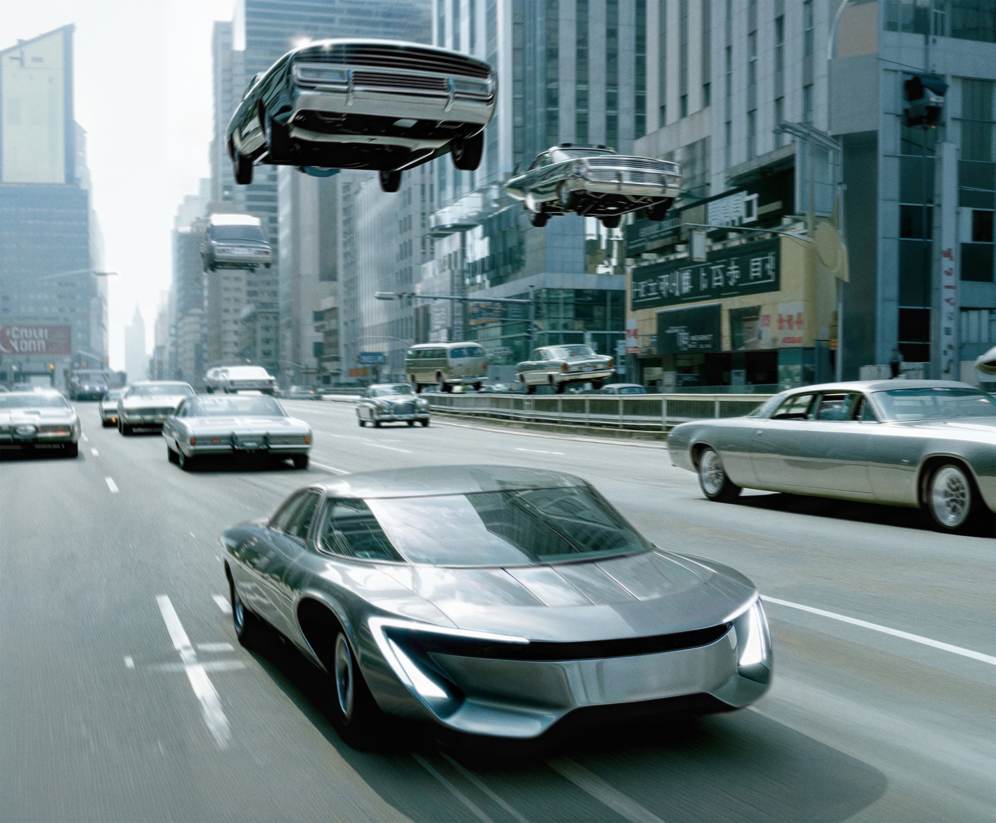
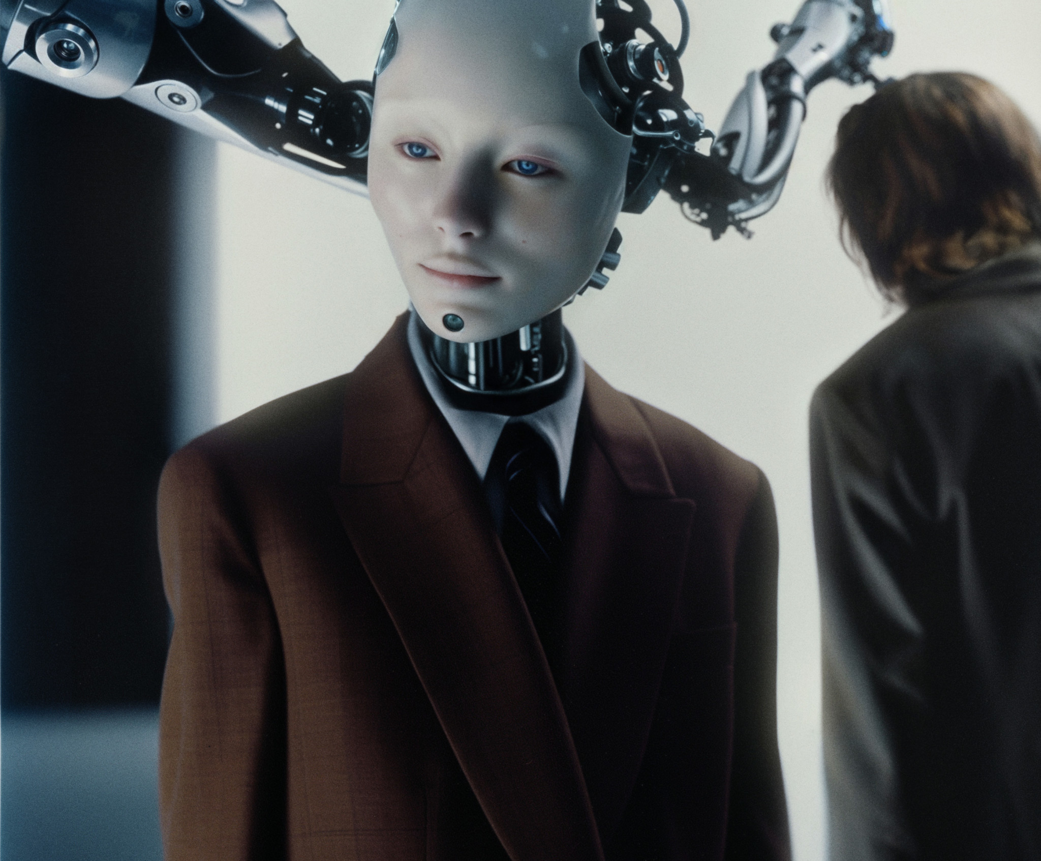
Futuristic. Nods to the 1969 technological revolution
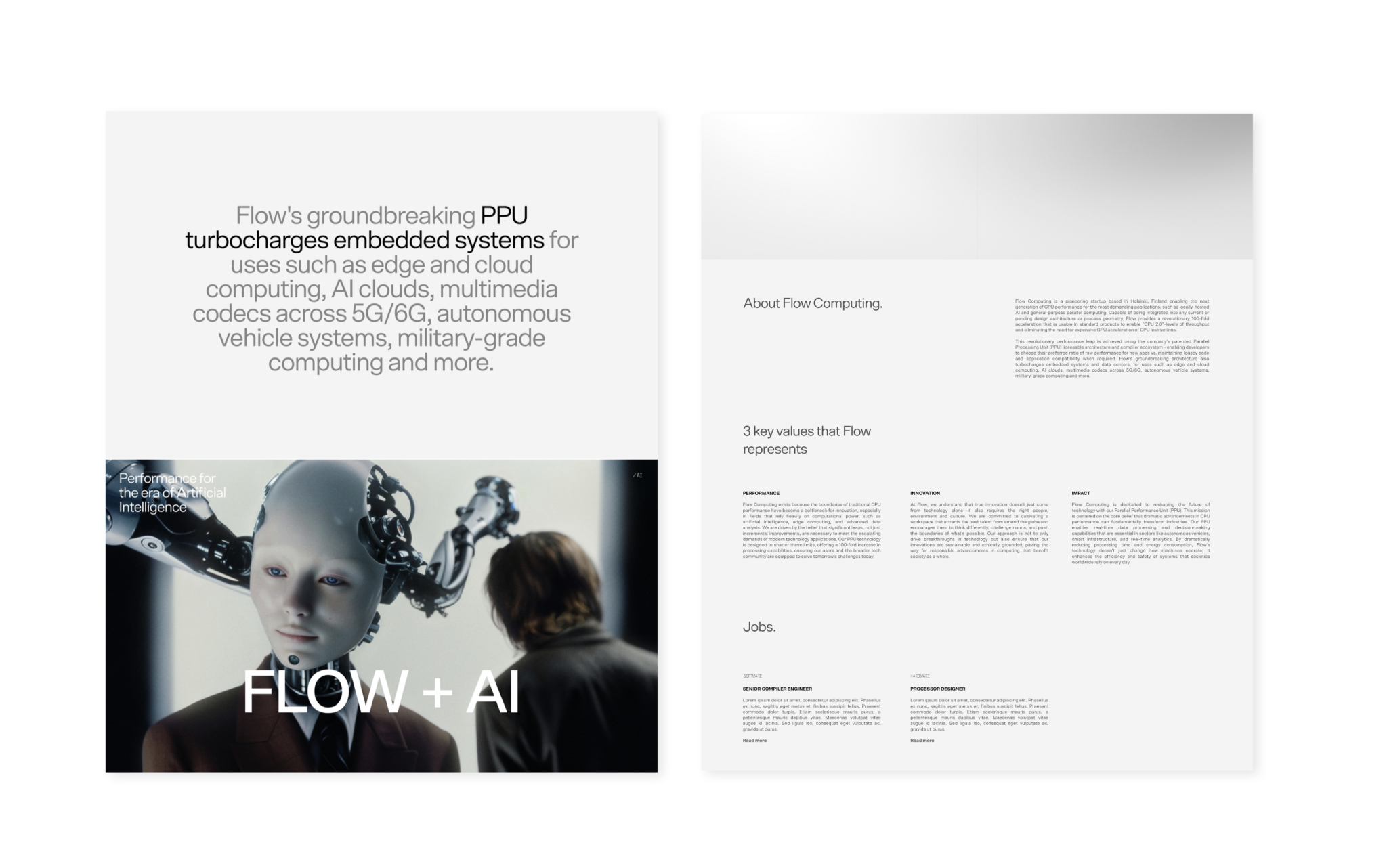
Flow Computing’s brand imagery is designed to reflect the groundbreaking potential of their Parallel Processing Unit. The visual identity merges minimalist layouts with clean 3D imagery and futuristic, AI-generated graphics, capturing the transformative power of the technology. The imagery blends modern AI elements with nods to the 1969 technological revolution, symbolizing the synergy between AI and the brand’s bold vision for the future. The new wordmark, transitioning from the full company name to the “Flow treated” version in motion, visually embodies the brand’s core essence—revolutionizing performance and unlocking new possibilities for the future of computing.
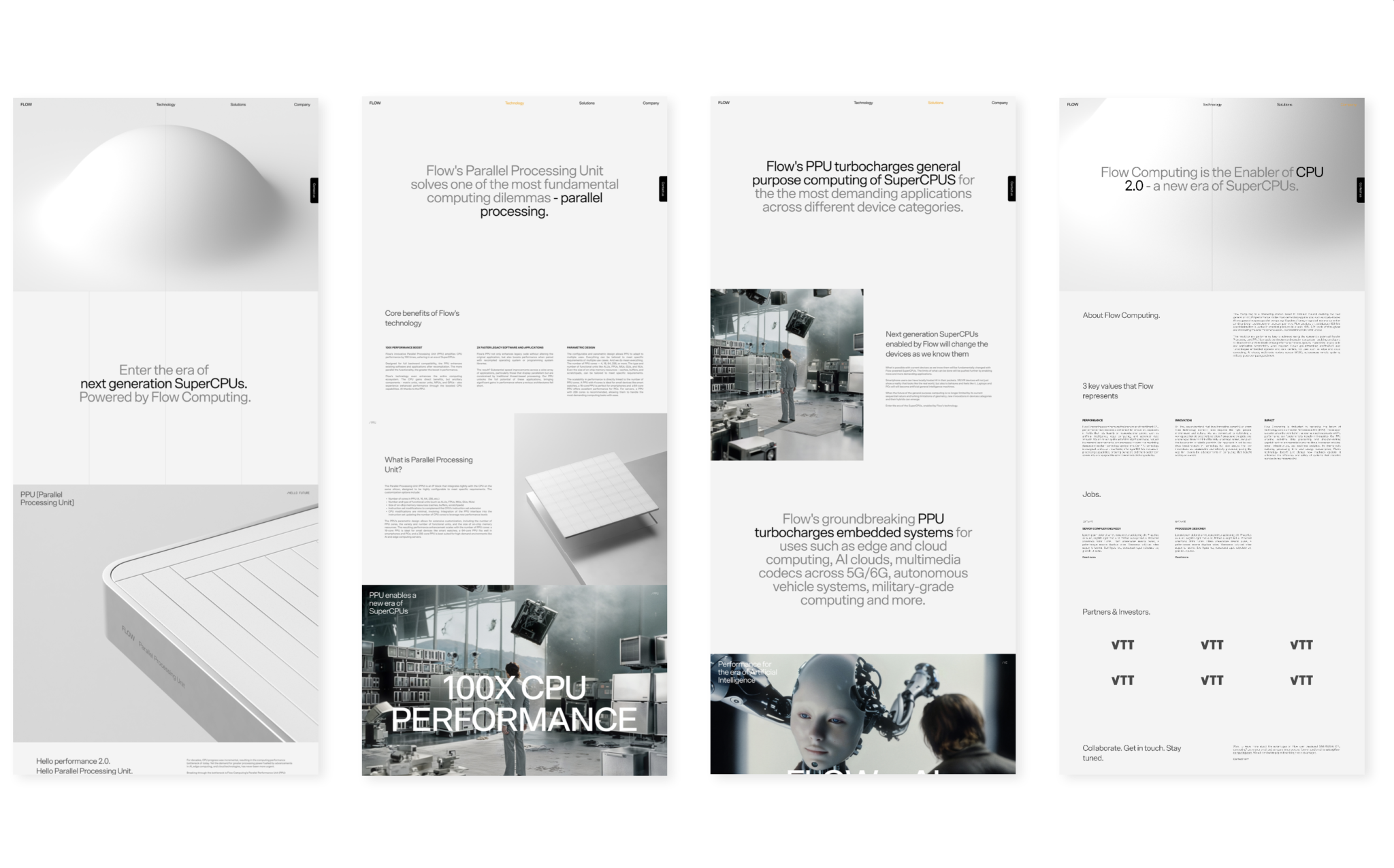
The final visual approach embraces ultra-minimalism, highlighted by smooth animations, impactful imagery, and meaningful messaging. This polished aesthetic creates a strong, engaging presence, effectively conveying the brand’s innovative essence. For more technical visuals, a line-drawing style was used to represent complex ideas, inspired by the intricate details of hard drives, CPUs, and modern computing components. This style not only connects the brand’s visual identity with its technological roots but also subtly references the 1969 technological revolution, bridging past advancements with the bold future the brand is shaping.
Production.
Client
Flow Computing
CEO: Timo Valtonen
Strategy Advisor: Jussi Mäkinen
20/20
Creative Director: Jyri von Schoultz
Client Director: Mia Oksala
Art Director: Jenny Stringer
3D Imagery: Santeri Kekkonen
AI Imagery: Elias Lauronen
Tech Development: Isko Salminen