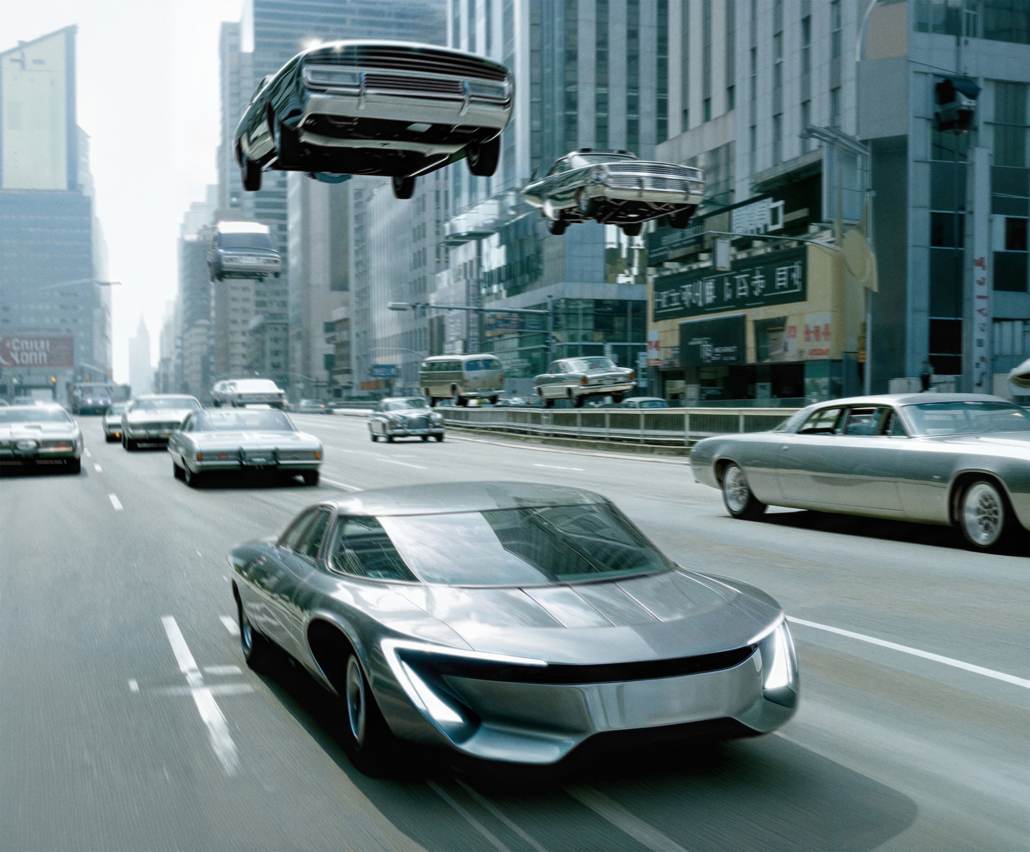
Enter the era of next generation SuperCPUs. Powered by Flow Computing.
Hello performance 2.0. Hello Parallel Processing Unit.
Flow Computing needed a brand and website to match their groundbreaking innovation— Their parrallel processing unit can instantly double any CPU's performance and potentially increase it by 100x through software optimizations. We created a cohesive brand identity and a state-of-the-art website, inspired by futuristic, historic, surreal, filmic, and generated themes.
Background.
For decades, CPU progress was incremental, resulting in the computing performance bottleneck of today. Yet the demand for greater processing power fuelled by advancements in AI, edge computing, and cloud technologies, has never been more urgent. Breaking through the bottleneck is Flow Computing’s Parallel Performance Unit (PPU) architecture. A truly groundbreaking enhancement that brings up to 100X performance boost to any CPU in any architecture. Fully backwards compatible, Flow technology even doubles the performance of most legacy applications after recompiling.
Flow’s PPU architecture not only meets but exceeds today’s demand for speed and efficiency— ushering in a new era of supercharged CPUs.
As we’re dealing with extremely inspiring and complex technology our purpose is to approach it in a manner that empowers and simplifies it to the level that inspires, engages and informs the audience, may it be the academics or other professionals in the tech space and beyond.Visual & Brand Strategy
Our visual identity merges minimalist academic layouts with timeless design. This is complemented by clean and timeless 3D images and futuristic AI-generated graphics that showcase the transformative potential of Parallel Processing Unit. These elements highlight how Flow Computing and AI can shape the future.
We emphasize Flow Imagery to illustrate the collaboration between AI and our brand. This approach blends minimalistic design with AI-powered visuals, subtly referencing the 1969 technological revolution while integrating modern AI artifacts to reveal the present-day origins of our imagery.
The new wordmark transforms from the full official company name into the “optimized” or “Flow treated” version when in motion. One of the key elements of the new wordmark is what happens in between when it’s in motion — the symbolical transition between these two version as we transform it by code to make it more optimised.

FLOW www - The place where it all comes together.
The visual approach for the webpage is ultra minimalistic, but brought to life by smooth and noble animations, powerful imagery and meaningful messaging that makes an impact in the tech field and beyond.
The more technical and explaining imagery will be crafted from more technical prespetive, using (technical) line-drawing style as our way to communicate more complex things or actions that needs to be visualised. Inspired by hard-drives, CPU’s, computer components and all those magnificient wiring and details that goes into computing.

Production.
Client
Flow Computing
CEO: Timo Valtonen
Strategy Advisor: Jussi Mäkinen
20/20
Creative Director: Jyri von Schoultz
Client Director: Mia Oksala
Art Director: Jenny Stringer
3D Imagery: Santeri Kekkonen
AI Imagery: Elias Lauronen
Tech Development: Isko Salminen


