Adea
With design traditions that go back all the way to 1959, Adea’s world-famous furniture are still custom-built with proud craftsmanship, in Kauhajoki, Finland.
Each Adea product is carefully considered and sustainably produced. Each part, function and form is carefully mated into something much more than a sum of its parts. They are made to be experienced, not merely to be looked at.
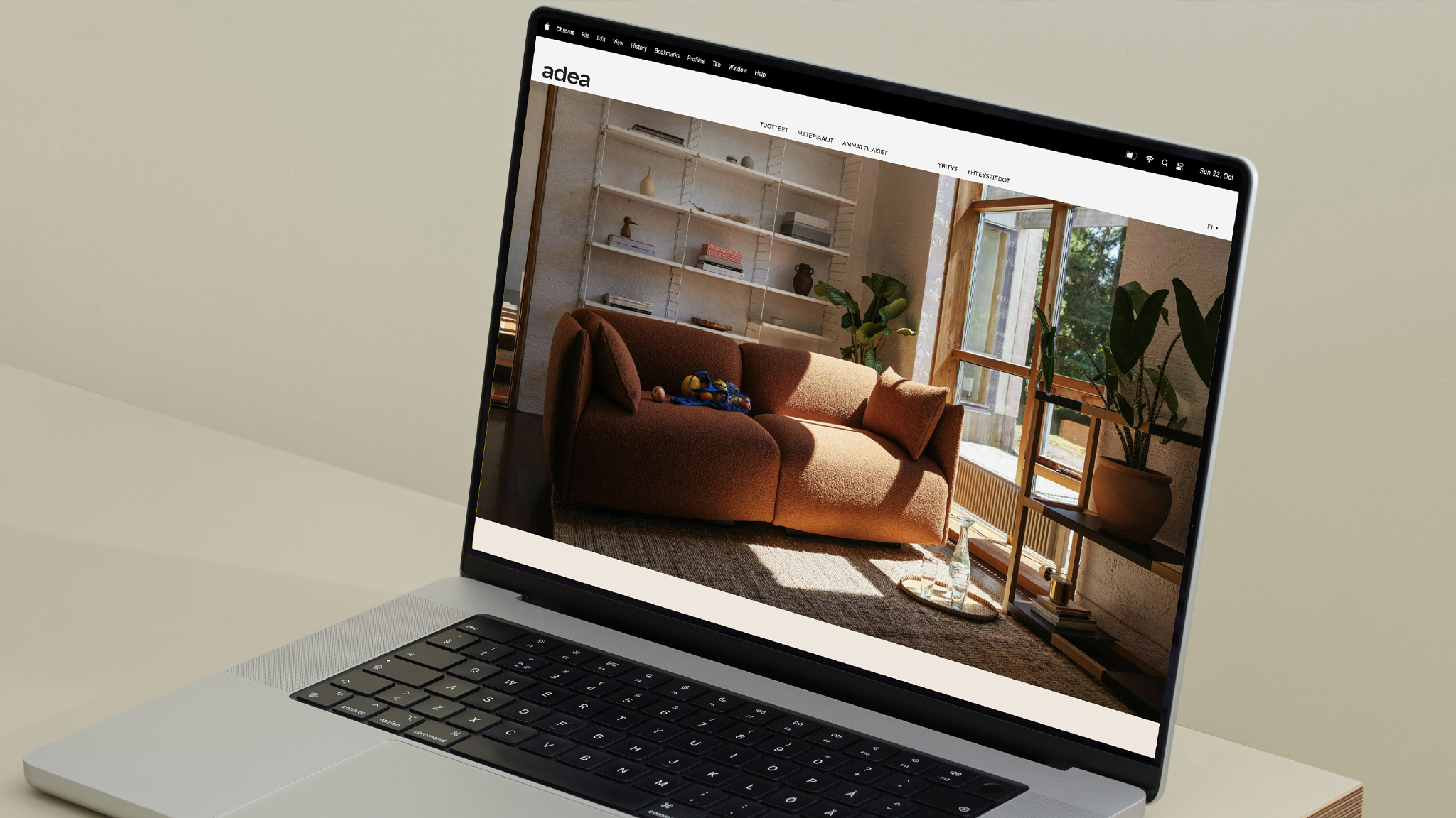
We refreshed Adea’s visual identity, brand images and website to showcase their dedication to timeless design even more vividly.

Background
The secret to having become a world-renowned manufacturer isn’t in their premium craftsmanship, or skillfully combining different materials. It is in the warmth of the people who make the Adea furniture.
We defined this as the guiding light of Adea’s brand. The drive to make moments of taking a brief pause on the chair or spending the whole evening on the sofa with your family just a little bit better, warmer and stylish, is at the very heart of Adea.
Solution
Our focus for Adea's brand identity renewal was to approach it with professional simplicity – to make it modern, high-quality, and approachable.
Adea's visual identity relies heavily on the black and white expression. This is supported by two primary colors, dark green and green, as well as a secondary color palette of muted colors.
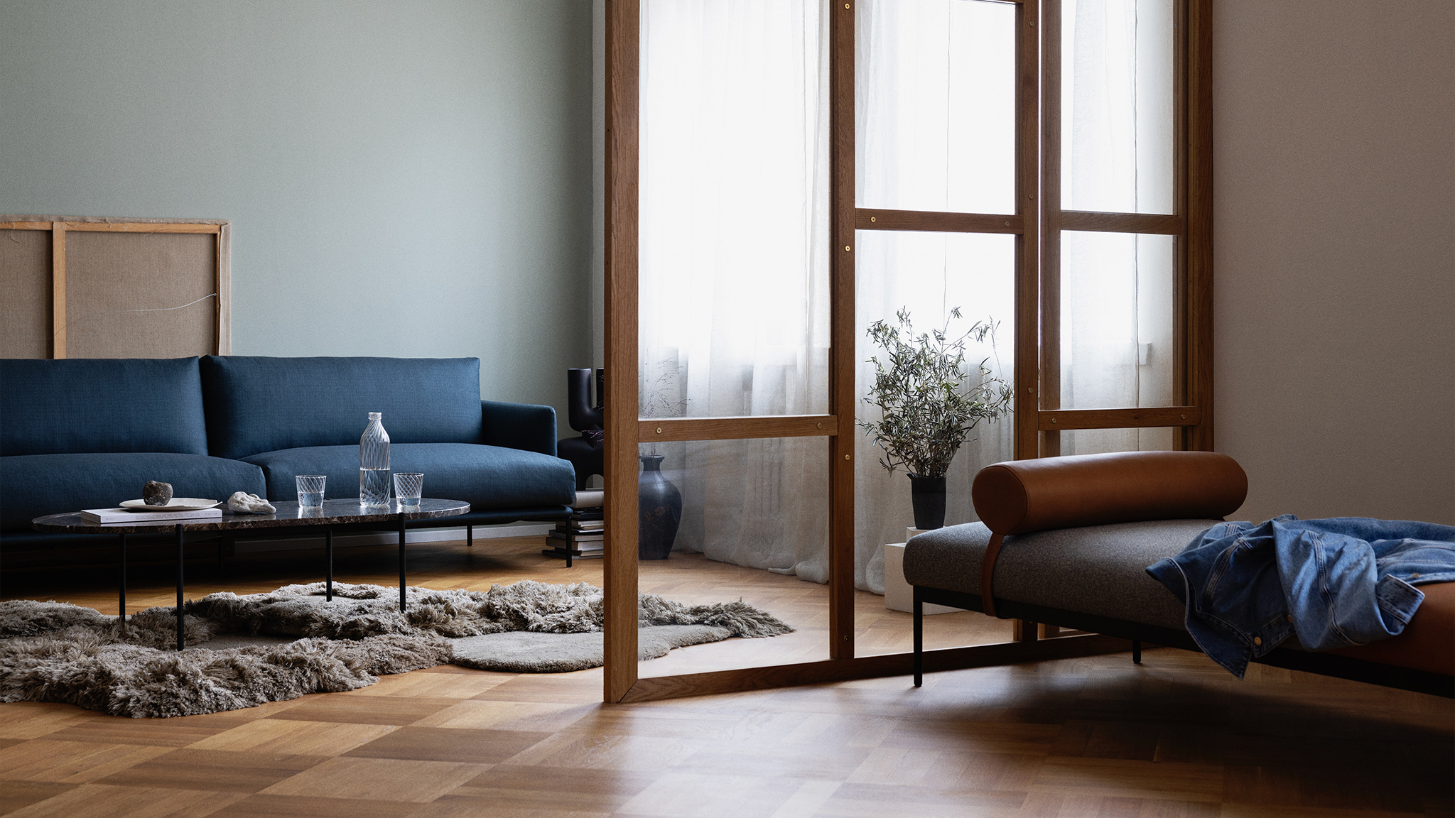
The main focus on the visual identity is centered on vivid and high-quality brand imagery that presents Adea's products in different environments and homes. They highlight the tone of voice of the brand – representing Adea's brand as warm and welcoming in a subtle way.

Imagery
Adea's imagery is built from different parts of the brand's story – all the way from the factories to our homes and from material close-ups into experimental and abstract imagery showcasing the various qualities of Adea's products.
As the factory images present the craftsmanship behind the products in a more documentary style, lifestyle images highlight the brand’s essence. A relaxed and effortless style, supported with sleek styling, is always the starting point of the tone of voice that showcases the high-quality aspects of the brand.
Adea's premium products and their details are showcased with a more minimal and plain visual style. All of these are supported with abstract imagery that tells stories about the usage of various materials behind Adea products, with clear and simplified compositions.
Production
Client
Adea
20/20
Client Director: Mia Oksala
Producer: Veera Moilanen
Art Director: Tino Nyman
Copywriter: Rasmus Stoltzenberg
Photography
Photographer: Anton Sucksdorff
Assistant: Jari Hämäläinen
Retouch: Patricia Karlsson
Set Design: Piia Honkanen
Website Development
Isko Salminen


